 This is probably a really geeky topic, but if we’re honest with ourselves, we all have a favorite font. Maybe it’s the font you use when you write email, or the font you usually pick for a Word document. At some point, we have all chosen a typeface that looks good and feels good. Indeed, your font is a fashion statement for the web.
Vista introduces a new generation of fonts
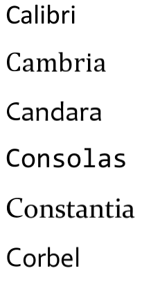
I brought this up because I’ve been using Word and Excel 2007 a lot recently. It came bundled with my copy of Windows Vista, and today I thought to myself, “Damn, this font is sexy!” I was of course admiring Microsoft’s new Calibri font, one of six new antialiased fonts, set to replace Arial, Courier New, Georgia, Times New Roman, Trebuchet MS, and Verdana, fonts which have dominated the web since their introduction in Windows 95.
Experimenting with Calibri
The six “C” fonts are Calibri, Cambria, Candara, Consolas, Constantia and Corbel, and I’ve chosen to write this post in Calibri. Of course, if you don’t have these fonts installed on your system, you won’t notice the difference between this and my other posts.
Are you a font buff?
I’m not going to get into specifics but you can read more in the article, New Vista Fonts and the Web, and for information on downloading them and installing them on an older Windows OS, read Downloading and Using Vista Web Fonts.
What’s your favorite font?
So, until now, I have been a fan of the simple, but elegant, Verdana font, and I’m also partial to a bit of Arial. What’s your favorite font, and don’t pretend you don’t have one! 😉
If you like, you can find me on Twitter at @nick_ramsay. I'd love to hear from you!
I have a thing for Tahoma… Verdana is a close second. 😉
I also have a “thing” for Tahoma when writing emails or documents. It’s easy on the eyes and doesn’t get boring like several pages of Times New Roman or Courier might.
That said, if it’s internet chat, then I’m all about the FixedSys. Sure, the font is reminiscent of the old days of DOS but, since using it exclusively on mIRC since 1998, I just can’t imagine chatting with any other font 😛
When it comes to posting things online, though, I prefer to use a font that is Unicode compatible. Unfortunately, when people use fonts that are only ASCII or ISO-8859-1 compatible, my katakana becomes a series of question marks 😕
The problem is that most of us haven’t got a clue about font compatibility, so it’s really up to the developers (WordPress, etc.) to use Unicode fonts as default.
I agree. It is up to the theme designers to ensure they’re selecting a proper unicode-compatible font to display all characters on the site. People who (unknowingly) use a Latin1-based database (which is 99% of all blogs that started with a MySQL 4 database, and about 20% of all sites that started on a MySQL 5 database) can get around the problem of using Katakana, Kanji, Hebrew or Arabic characters by ensuring their sites are UTF-8-ready (which is true by default for everything in WordPress since 2.0, and most blogging packages starting this year).
To be completely honest, I’d rather see the W3C make it a “highly advantageous standard” to force all sites and browsers to be 100% UTF-based. Sure, it’ll use more bandwidth and take up more space in the database, but it would enable people from everywhere to write and otherwise provide content in their preferred character set.
Why do developers and web providers continue to ignore the fact that, while Latin-based characters are used by the majority of people on Earth, it’s not the only that way people communicate? 😕
Perhaps Web 3.0 will be the true internationalization of the web platform….
Georgia, Comic Sans.
Ah, who doesn’t love Comic? 🙂
I just love Times New Roman. So standard, so powerful, so authoritative! Yep, it has everything I look for in a font and more!
9 times out of 10 Arial is my font of choice.
Verdana